

Here is a final demo of this workshop, along with the source code used to make it.
styled-components is a library that creates styled React components in a clean, idiomatic way. In this workshop, we'll use styled-components to create a small weather app that pulls data from the free Dark Sky API. This workshop uses the Parcel bundler, but you can use any bundler you wish (Webpack, Rollup, etc.). This workshop assumes that you have a recent version of node and npm installed.
Setup
In your command line, navigate to wherever you keep your projects and create a new directory with mkdir styled-weather and cd styled-weather. Run npm init and follow the prompts, fill out the fields with whatever you want.
Next, we need to install our libraries:
npm i react react-dom styled-components --save
npm i parcel-bundler --save-dev
Now, in the "scripts" field of package.json, add the following:
"scripts": {
  "test": "parcel src/index.html",
  "start": "parcel src/index.html",
  "build": "parcel build src/index.html"
},
These will enable npm start to call the parcel bundler to package and serve our app on port 1234. You can override the port number with -p <number>.
Create a new subdirectory call src in styled-weather, and create the files index.html, index.css, index.js, animation.js, and one more subdirectory named components.
index.html
<!DOCTYPE html>
<html lang="en">
  <head>
    <meta charset="UTF-8" />
    <meta name="viewport" content="width=device-width, initial-scale=1.0" />
    <meta http-equiv="X-UA-Compatible" content="ie=edge" />
    <link rel="stylesheet" href="./index.css" />
    <title>Hacker Skies</title>
  </head>
  <body>
    <div id="root"></div>
    <script src="./index.js"></script>
  </body>
</html>
index.css
html,
body,
#root {
  width: 100%;
  height: 100%;
  padding: 0;
  margin: 0;

  display: flex;
  flex-direction: column;
  justify-content: center;
  align-items: center;

  background: #fdfbfb;
  background-image: linear-gradient(120deg, #fdfbfb 0%, #ebedee 100%);
  font-family: -apple-system, BlinkMacSystemFont, 'Segoe UI', Roboto, sans-serif;
  font-weight: bold;
  color: #333;
}
index.js
import React from 'react'
import ReactDOM from 'react-dom'
import { App } from './components/App'

export const secretKey = '<YOUR_SECRET_KEY>'
export const getCoords = (cb) => navigator.geolocation.getCurrentPosition(cb)
export const baseurl =
  'https://cors-anywhere.herokuapp.com/https://api.darksky.net/forecast/'

ReactDOM.render(<App />, document.getElementById('root'))
Getting a Secret Key
Navigate to darksky.net/dev and create a free developer account. This will give you access to the dark sky API for free (up to 1000 free requests per day). You can generate or re-generate your secret key on the "console" page located at (darksky.net/dev/account). Replace the provided key with <YOUR_SECRET_KEY> in index.js.
Running the App
Test the app by running npm start and navigating to localhost:1234. You should see an error, as App is a component that does not yet exist.
Components
React apps (along with styled-components) are built with the idea of components, which are pieces of your application that encapsulate all their own stuff—their data, state, styling, subcomponents. Components can then be composed together to create complex UIs..
We'll keep all of our components in our components subdirectory. There are two types of components used in this workshop, stateful and stateless/functional. A stateful component has internal data, and it updates every time its data changes. A stateless component does not maintain any internal state, rather it renders based on the properties that are passed to it.
components/App.js
import React, { Component } from 'react'
import styled from 'styled-components'
import { secretKey, getCoords, baseurl } from '../index'
import { Loading } from './Loading'
import { Weather } from './Weather'
import { Card } from './Card'

export class App extends Component {
  state = {
    isLoading: true,
    requested: null
  }

  componentDidMount() {
    getCoords(({ coords }) => {
      fetch(`${baseurl}${secretKey}/${coords.latitude},${coords.longitude}`)
        .then((res) => res.json())
        .then((dat) => dat.currently)
        .then((requested) => {
          this.setState({ isLoading: false, requested })
        })
    })
  }

  render() {
    return (
      <Card>
        {this.state.isLoading ? <Loading>Loading...</Loading> : null}
        {this.state.requested ? <Weather dat={this.state.requested} /> : null}
      </Card>
    )
  }
}
This component serves as the "container" for our entire application. It manages the state of the whole application. The two pieces of state that this application uses is isLoading and requested. requested stores the result of our API call, and isLoading tells us weather the API request has completed yet. componentDidMount is a component lifecycle hook that triggers once, right after the component is mounted to the DOM, which makes it the perfect place to put our API request. The dark sky API exposes a /forecast endpoint, which responds with a simple JSON object. After parsing the JSON with res => res.json(), we filter the data and updates the components state. Calling setState() will queue a re-render of the App component, which will switch from our loading state to our weather state.
animation.js
import styled, { keyframes } from 'styled-components'

export const FadeRight = keyframes`
  from {
    opacity: 0;
    transform: translateX(10px)
  }

  to {
    opacity: 1;
    transform: translateX(0px)
  }
`

export const FadeLeft = keyframes`
  from {
    opacity: 0;
    transform: translateX(-10px)
  }

  to {
    opacity: 1;
    transform: translateX(0px)
  }
`

export const FadeUp = keyframes`
  from {
    opacity: 0;
    transform: translateY(10px)
  }

  to {
    opacity: 1;
    transform: translateX(0px)
  }
`
This is not a true component, so it does not belong in the /components directory. The styled-components library provides a keyframes function, which will enable us to define CSS animation keyframes right in our application code. Here we define three separate animations: FadeRight, FadeLeft, and FadeUp. Each of these is an entrance that we will use to reveal some data in our app.
components/Card.js
import styled from 'styled-components'

export const Card = styled.div`
  width: 100%;
  height: 100%;
  max-width: 300px;
  max-height: 512px;
  background: #fff;

  display: flex;
  flex-direction: column;
  justify-content: flex-start;
  align-items: center;

  @media (min-width: 500px) {
    border-radius: 5px;
    box-shadow: 0 3px 6px rgba(0, 0, 0, 0.16), 0 3px 6px rgba(0, 0, 0, 0.24);
  }
`
The Card component just serves as a container for our other components, so it doesn't need to read any properties or maintain any state. The styled.div function will return a new React component with the styles in the template literal. You can use any standard CSS properties in the template string.
components/Detail.js
import React from 'react'
import styled from 'styled-components'
import { FadeUp } from '../animation'

const Container = styled.div`
  width: 100%;
  height: 200px;

  display: flex;
  flex-direction: column;
  justify-content: flex-start;
  align-items: center;

  margin-top: auto;
  animation: ${FadeUp} 1s ease-out 0s;
  font-size: 16px;
`

const Row = styled.div`
  width: 100%;
  height: 32px;

  display: flex;
  flex-direction: row;
  justify-content: space-evenly;
  align-items: center;
  text-align: center;
`

export const Details = ({ wSpeed, humid, wGust, cover }) => (
  <Container>
    <Row>
      <span>Wind Speed: {wSpeed}</span>
      Humidity: {humid}
      <span />
    </Row>
    <Row>
      <span>Wind Gust: {wGust}</span>
      Cloud Cover: {cover}
      <span />
    </Row>
  </Container>
)
This is a stateless component, it simply renders any properties passed to it. To position all four fields, we use two styled-components with the flexbox property. We also import our FadeUp animation so that we can use it in the Container component.
components/Loading.js
import styled from 'styled-components'

export const Loading = styled.p`
  margin-top: auto;
  margin-bottom: auto;
`
This is likely the most basic styled-component you will ever encounter. Because its parent uses display: flex, we can use auto margins to vertically center the element on the card.
components/Summary.js
import React from 'react'
import styled from 'styled-components'
import { FadeLeft } from '../animation'

const Large = styled.p`
  font-size: 24px;
  animation: ${FadeLeft} 0.5s ease-out 0s;
  text-align: center;
`

export const Summary = ({ weather }) => <Large>{weather}</Large>
This component could have exported a single styled component instead of exporting a functional component. This example demonstrates how we can simplify our react code by using styled-components, as they have all the boilerplate abstracted away into a collection of idiomatic functions. (like, styled.div or styled.p, which create div and p elements respectively).
components/Temperature.js
import React from 'react'
import styled from 'styled-components'
import { FadeRight } from '../animation'

const Large = styled.p`
  font-size: 32px;
  animation: ${FadeRight} 0.5s ease-out 0s;
  text-align: center;
`

export const Temperature = ({ temp }) => (
  <Large>
    {temp}
    °F
  </Large>
)
This component functions nearly identically to the Summary component. The one advantage to passing a property instead of listing the temperature inline with a pure styled component is that it allows for cleaner code on in the Weather component. (It abstracts away the appending of "°F").
components/Weather.js
import React, { Component } from 'react'
import styled from 'styled-components'
import { Temperature } from './Temperature'
import { Summary } from './Summary'
import { Details } from './Details'

const Container = styled.div`
  width: 100%;
  height: 100%;
  display: flex;
  flex-direction: column;
  justify-content: flex-start;
  align-items: center;
`

export const Weather = ({ dat }) => (
  <Container>
    <Temperature temp={dat.temperature} />
    <Summary weather={dat.summary} />
    <Details
      wSpeed={dat.windSpeed}
      wGust={dat.windGust}
      humid={dat.humidity}
      cover={dat.cloudCover}
    />
  </Container>
)
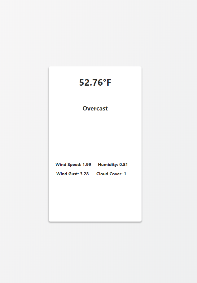
This component renders the app after we receive data from the Dark Sky's API. It takes data passed to it (through properties) and routs it to the proper components for rendering. Once this component is completed, you should be able to bundle and run your app (with npm start) error free. The completed app should look like this:
Challenges
- Create a production build with
npm run build - Add a "dark mode" (hint: you can pass props to
styled-components) - Toggle to Celsius on click (hint: convert
Temperature.jsinto a stateful component, and add anonClickmethod that modifies state) - Add a refresh button